kynigma
Web · Brand
Kynigma
Two people, presented as a practice — taste as the pitch.
Overview
The studio site for Kynigma, a two-person design and engineering practice — a compact statement of who they are and what they make.
- Role
- Design engineering · brand site
- Stack
- Web · Design engineering · Brand site

Making two people read as a practice
A studio site has one job: make two people look like a practice. It needs to communicate taste and capability in very few pages without collapsing into a generic template. Every section has to justify its existence, because a thin studio site reads as unfinished while a bloated one reads as insecure.
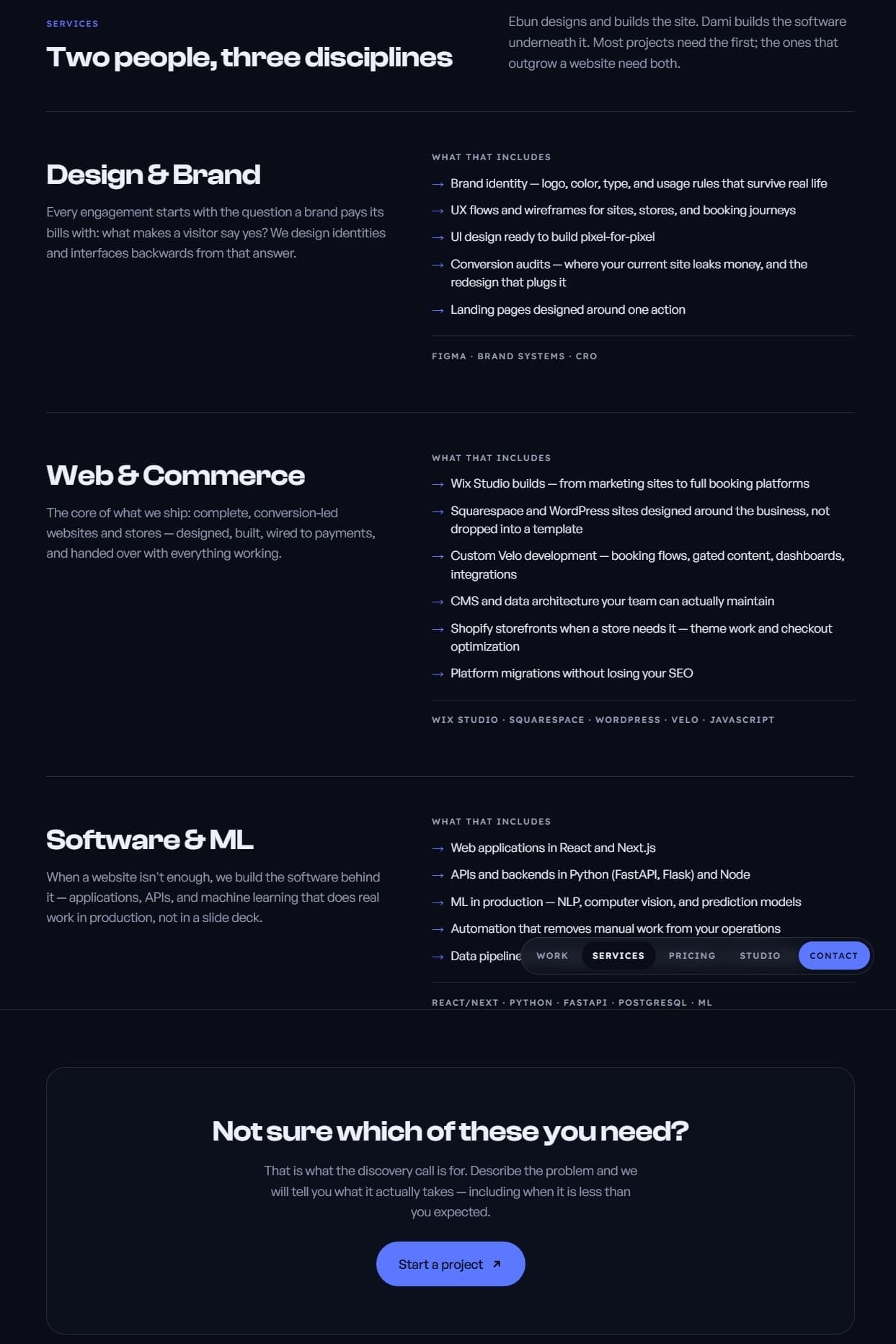
The site is the portfolio piece
For a design and engineering studio, the site cannot just describe capability — it has to exhibit it. Typography and spacing carry the identity rather than decoration, and a visitor should conclude the studio has taste before reading a single project description.
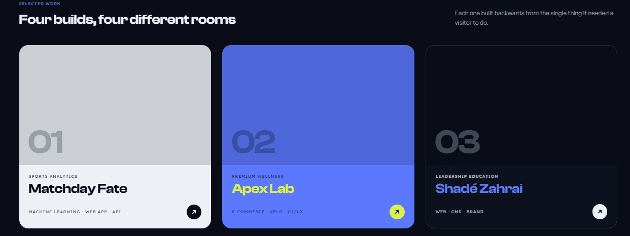
A frame that grows with the studio
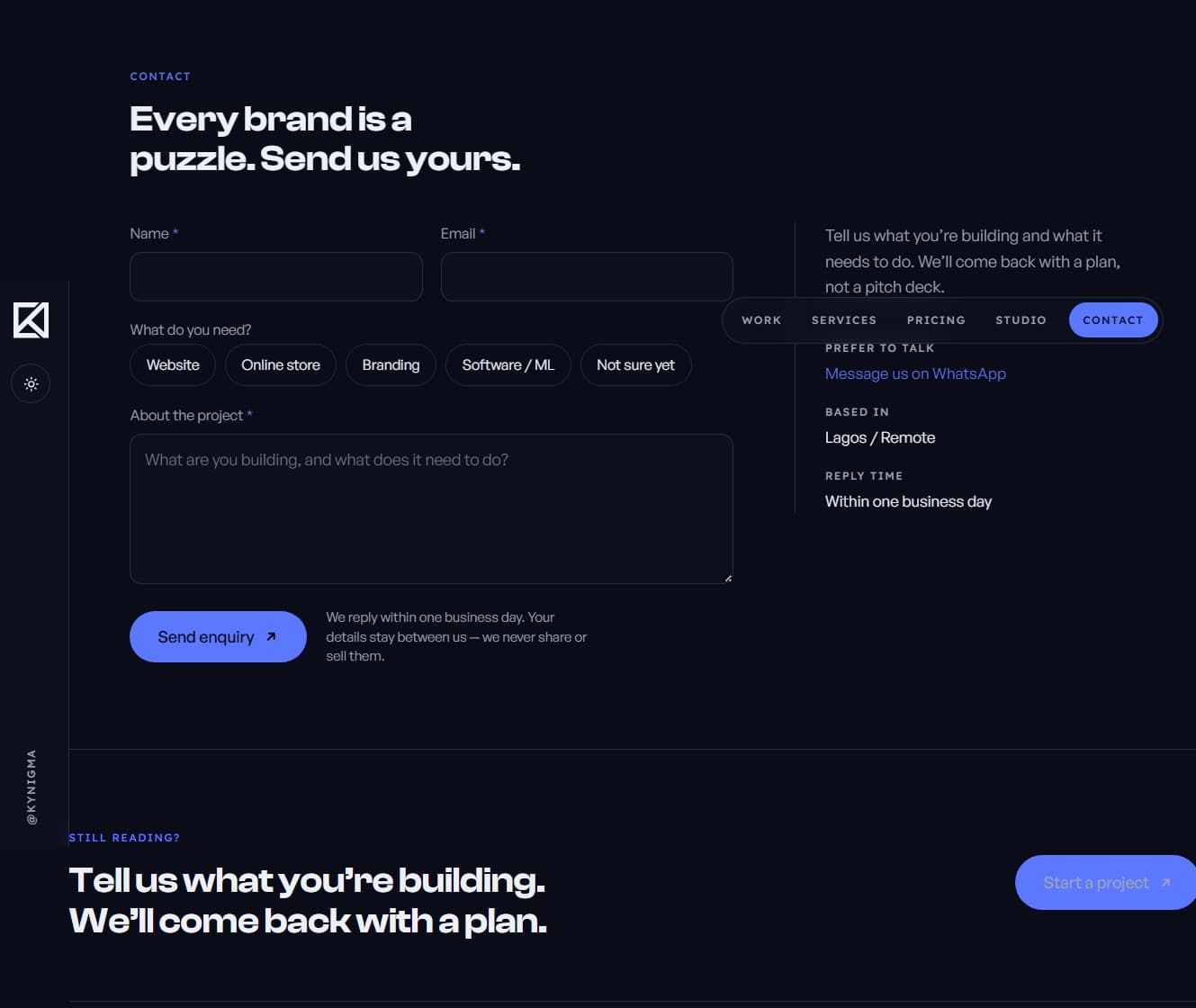
Project views are structured to grow: each new engagement slots into the same considered frame without a redesign, so the studio can publish new work in an afternoon without design drift.
Structure
- 01
Identity
- 02
Selected work
- 03
Engagement frame
- 04
Site
The result
A studio presence that reads as designed rather than assembled, built to grow as the studio's body of work does — the site is itself the portfolio piece that proves the practice can do the work it sells.
- studio identity
- compact build
- design-led
If I built it again
Small sites punish every extra section, which made this a good exercise in saying no. If I rebuilt it, I would push the work itself even further forward — one project deep-view as the homepage hero.
Further reading + source